
About Our Brand
About Our Brand
Our Purpose
Inspiring experiences, creating places for good. Our shared purpose is our “why” - it is consistent across the Group and is the ‘glue’ that binds us together. It articulates “why” we are in business and “why” we do things the way we do.
Our Values
These articulate the beliefs and behaviours that are important to us. They help to guide how we think, how we act and what we value.

- Teamwork is the key to our success.
- We challenge and support each other.
- We partner with our colleagues, customers and stakeholders to create shared value.
- We share our expertise and seek others’ advice.

- Respect for our customers and ourselves is at the heart of everything we do.
- We listen and seek to understand.
- We believe in each other’s expertise.
- We appreciate and value each-other’s commitment and the balance we all need in our lives.

- Curiosity drives us to seek opportunities
- to innovate.
- We are energetic and purposeful.
- We are proactive, not reactive.
- We embrace change.

- Authenticity is the essence of all our dealings.
- We celebrate diversity.
- We do what’s right.
- We take ownership and accept accountability.
- We are what we do.
Our Corporate Brandmark
Our Corporate Brandmark
Our corporate brandmark says a lot about our business, our culture and our heritage. Considered as a whole, our corporate brandmark is an expression of our shared purpose of - Inspiring experiences, creating places for good. - that we aim to create lasting shared value, for our people, the businesses and communities we serve, within the ecosystem in which we will live for generations. The diamond symbol cannot be detached from the logotype or used in isolation, except as a standalone social media avatar.
Symbol
Our diamond emblem is a universal symbol of quality and value, and is a dynamic shape that reflects our strong, stable and progressive nature. The curved strokes coming together to form the diamond represent the powerful synergy between our company and our partners. This symbol therefore reflects our nature as a diverse yet integrated real estate Group, and our belief that value arises from the combination of expertise and collaboration. The power and vitality in collaboration is further reflected in our choice of red as our signature corporate colour.
Logo hierarchy
The brandmark variants hierarchy usage should be as follows:
- Full colour
- Full colour reverse
- Reverse white
- Greyscale
Our brandmark should be presented in full colour whenever possible. Displaying our brandmark in one or two colours is never preferred. The greyscale brandmark should only be used when a full-colour print is not available (e.g., mono newsprint and legal documents that are meant to be in black & white only).
1. Full colour

For use against white background only.
2. Full colour reverse

Two colours only. For use only when the full colour brandmark is compromised.
3. Reverse white

For use only when the full colour reverse brandmark is compromised.
4. Greyscale

For use only when a full-colour print is not available.
By downloading our assets, you accept our Terms and Conditions.
Clear space
When we use our brandmark, we must follow clear space rules to ensure it remains prominent. Maintain a clear space rule of height of F squared at all times.
Minimum sizes
The minimum height of the core brandmark is 7mm in print applications and 36px in digital applications.


Colours
Colours
Core colour palette
The core colour palette is inspired by our brandmark. Frasers Property red is our dominant colour. It has been chosen strategically so that Frasers Property owns a distinct colour in the market.

Frasers Property Red

Frasers Property Grey

Black

White
Secondary colour palette
Complementing the core colour palette is a collection of sophisticated hues. Our secondary colour palette can be used as backgrounds and in conjunction with the core colours for premium products, services and special events.

Crimson

Burgundy

Lavender

Champagne

Pine

Slate

Mushroom

Pearl
Bright colour palette
Finally, our bright colour palette provides a layer of freshness and vibrancy for use in retail, internal communications, and social. Note that this is not intended for general application.

Mint

Sea Green

Iris Blue

Sky Blue

Ocean Blue

Plum

Rose

Lilac

Butterscotch

Tangerine
Supergraphics
Supergraphics
To bring our brand to life, we have introduced a dynamic brand expression that plays on the idea of continuous flow and movement to express how we drive evolutionary change. The Supergraphic devices are designed to support the Frasers Property brand and its communications, and there are 10 expressions to select from.

The Supergraphics may be rotated or reflected to suit a design but may never be distorted by shearing or scaling unequally. Shown here are some guidelines on applying the Supergraphics.

Always try to anchor a portion of the Supergraphics to a corner or side or design element.

The Supergraphics may be reflected both vertically and horizontally.

The Supergraphics may be rotated proportionately.

Do not distort the Supergraphics in any way.

The Supergraphics may be used as a single colour.

The Supergraphics may be used with transparency.

The Supergraphics may be used with solid colour and transparency.

The Supergraphics may be used with the various colour palettes.

The Supergraphics may be used with gradient colour.

The Supergraphics may be used to frame the holding devices.

The Supergraphics may be used as an overlay on imagery.

The Supergraphics may be used to interact with imagery.
By downloading our assets, you accept our Terms and Conditions.
Iconography
Iconography
Our suite of icons are designed in a clean and contemporary style, and we have created an icon library to cover a wide range of communication requirements to keep all applications consistent.


By downloading our assets, you accept our Terms and Conditions.
Typography
Typography
We have three typefaces within the Frasers Property font family. In corporate materials, no other fonts may be used. All weights shown below include italics which can be used for quotes, foreign words or phrases.
English typefaces
Our corporate typeface is Synthese which has been selected due to its contemporary nature. Modern, clean, bold, sleek and sophisticated. As the primary typeface, it should be used principally throughout all touchpoints, including digital and apps.


Arial should be used as a default typeface for digital applications only when the corporate fonts are not available.


Lato can be used for apps only when Synthese cannot be used.


Chinese typefaces
We have two Chinese typefaces which must be used as specified. Microsoft Yahei UI and STHeiti have been selected as brand standard fonts for all Chinese language branding and communication materials.


Thai typefaces
We have two Thai typefaces which must be used as specified.
FC Subject has been selected as the main Thai typeface for all Thai language corporate marketing communications, signage and printed materials, usually produced by professional designers.


FC Paragraph is used as body copy and correspondence, and as a default typeface for all day to day correspondence and documentation in Thai.


For more typefaces, please refer to the full brand guidelines document (for licensed users only).
Tone of Voice
Tone of Voice
The following sections below outline a framework to help shape how we present information, set a tone for how we sound and look and guide us in the way we speak to the world.
Our brand purpose is the inspiration to bring our brand to life and our brand personality and language are powerful tools to continue building and leveraging our equity as a single, powerful, global property brand.
Our brand personality
Inspiring, knowledgeable, personable and influential, are the set of human characteristics of our brand personality – The True Transformer.


Our brand tone of voice
Our brand personality leads the way we communicate to our stakeholders and communities. Our tone of voice is guided by attributes of Accountability, Inclusivity, Ambition and Empowerment to reflect our shared purpose from a customer-centric and forward-looking perspective.
Ambitious + Empowering
Progressive, forward-looking leader committed to driving change, innovation and reinvention across the industry
Accountable
Trusted, Customer-centric
Inclusive
Empowering, Encouraging, Considerate
Photography
Photography
Our visual pillars
In general, our photography style reflects and captures our values. We have four main photography pillars; each designed to enhance our visual storytelling and complement our identity:
- Moments
- Intricate Details
- Inspirational
- Property


Moments
Moments imagery is Emotive, Precious, Real & Positive. It focuses on the relationship between people, or between people and place, and showcases people‘s interactions and expressions.


Intricate Details
Intricate details imagery is Contemporary, Sophisticated, Intriguing & Craftsmanship. It focuses on capturing the fine details, bespoke designed elements and embellishments of interior architectural features.


Inspirational
Inspirational imagery is Creative, Innovative, Collaborative & Motivational. It focuses on capturing a concept, an idea, with thoughtful or thought-provoking imagery.


Property
Property imagery includes drone, exterior and interior shots that captures the essence of the whole premise in locality, the building façade and the space interiors, respectively.
By downloading our assets, you accept our Terms and Conditions.
All images on this page are used for placement and illustrative purpose only and should not be reproduced.
Videography
Videography
Our filming styles
Videography is an important medium that allows us to bring to life our Purpose, and the inspiring experiences on offer across our portfolio and geographies in a visually exciting format, beyond words. We have three main filming styles; each designed to reflect and reinforce our brand identity in our video content:
- Interview/Documentary
- Product-focused
- Emotive Storytelling


Interview/Documentary
The filming angle are usually planned ahead of filming, with the subject feeling at ease and looking away from the camera in an interview or documentary style video.


Product-focused
The finer details, finishing, touches and close-ups are important to convey a real and authentic nature in a product-focused style video.


Emotive Storytelling
The emotions of the video talents are critical in capturing a more personable and positive feel to the scenes in an emotive storytelling style video.
All images on this page are used for placement and illustrative purpose only and should not be reproduced.
Video intro & outro
We have developed a supergraphic animation toolkit - which includes intros, outros and on-screen messaging for your corporate video projects. These are available in formats that can be used with video editing software such as Adobe Premiere and Final Cut Pro.
By downloading our assets, you accept our Terms and Conditions.
Brand Application
Brand Application
Our brand identity system is designed to be versatile to empower creativity within a framework. Here are some application examples for reference.
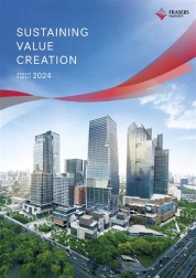
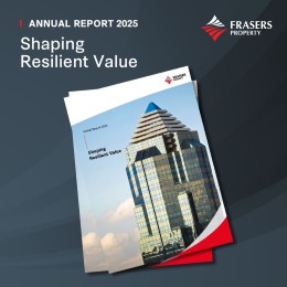
Annual Report

Poster

Poster

Skyscrapper Banners

Vertical Flag

Brochure

Collateral

Collateral
Social Media
Social Media

Web Banner

Cap

Lanyard
Email Signature
Branding Guidelines
Branding Guidelines
Full brand guidelines
For licensed users, log in via the button below to view and download the full brand guidelines. For further queries, reach out to your local Frasers Property’s representative.
Access our Asset Library
Access our Asset Library
For employees, click on the button below to log in.
For external partners without Aprimo license, fill in the form below.
By submitting this form, you agree to our Terms & Conditions.